Graphing with Gephi
The following PDF is a visual representation of my Facebook network. I completed this just after class last week as my first experiment with Gephi in an effort, simply, to get some data into the software and see what I could do with it. But, creating this graph had an additional benefit of showing me, in a way that I was having trouble imagining, the ways in which being able to graph a network can make things that may have been hidden, visible.
 In looking at the Facebook graph, for example, I was particularly interested in the outliers. There is a mass in the middle that represents my connections from college, many of which do in fact remain the most central in my life. But then, there are several adjacent networks that accurately mark different periods in my life—high school, for example, or my MA program, or the years I lived in Jersey City. Additionally, there are some smaller groups, or even single nodes, that each tell a story. I was particularly amused to find a distant connection, linked only through one friend, that reminded me of the disastrous weekend that my best friend visited with a new (and short lived) girlfriend. And yet, there she is, hanging precariously from the outer reaches of my network, connected by one thin edge.
But though I found the Facebook graph helpful in getting to know Gephi, I knew that in order to fully immerse myself, I need to begin with data that I generated, import it, and go from there—in short, I needed to start from scratch.
I spent a few days thinking about what might be valuable to visualize, and, particularly, I was thinking about how graphing might serve my final project. To that end, I imagined a graph that might show where the various contributors to The Paper, college students when they wrote, ended up publishing after college. Did they continue in the same vein of literary journalism? Did they continue in journalism at all? I still am interested in seeing this, but I have to wait until I have access to the data.
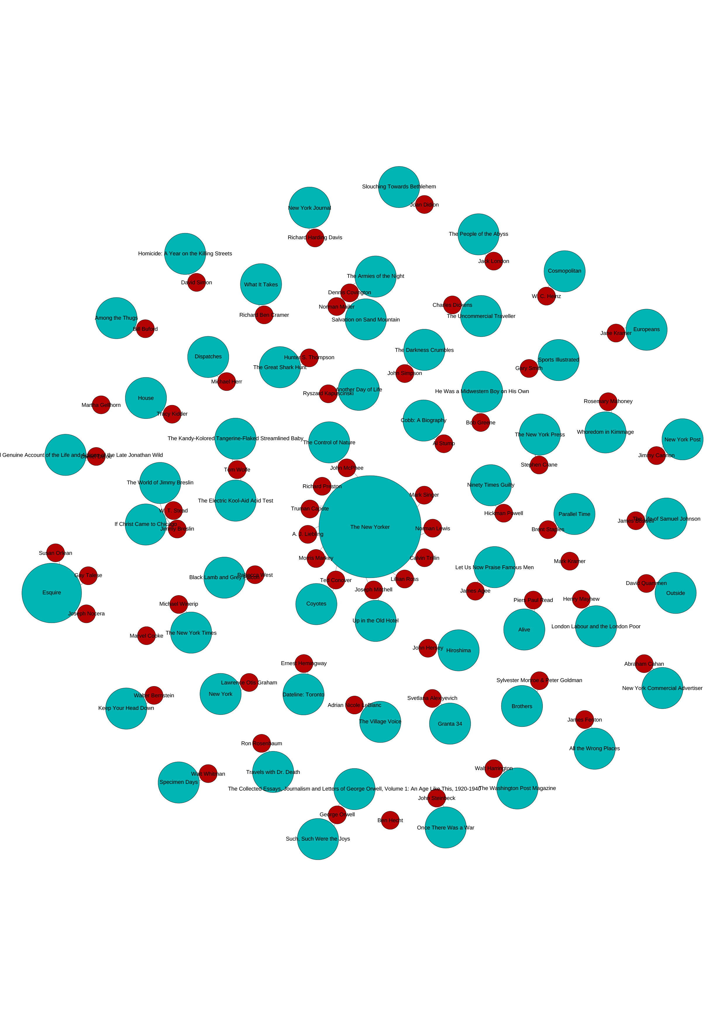
In the meantime, I decided to try to accomplish something similar, using data I have available. For this, I turned to a couple of anthologies of literary journalism, The Art of Fact and Literary Journalism. I added each writer from both anthologies, as well as the name and date of the pieces that are collected. That was the easy part. From their, I turned to the “Permissions” section of each book and tried to determine where each piece was originally published. My sense was that, in doing this, I would be able to easily see which publications published the most literary journalism from the mid-twentieth century through today.
 What I didn’t anticipate, particularly in the case of those selections from The Art of Fact, is that most permissions referred to books by the author as opposed to periodicals. My sense is that, even in many of these instances, the piece was originally published in a periodical before being collected into a collection of the author’s work, but I didn’t attempt to prove that for this exercise.
Instead, what you see here, is a graph of mostly disconnected nodes. That is, with the exception of a few periodicals—The New Yorker and Esquire are the most notable—the relationships exist only between a single author and a single periodical or book. Ultimately, this doesn’t make for a very interesting graph, but it did prove an important exercise in that it helped me understand the opportunities, as well as the limitations, of graphing, and how both of those really depend on the data I’m working with.
If you liked this post, consider sharing it or follow me on Twitter.